
You may not know, but our design team is quite versatile in terms of skills range. Surely, being part of a software company, our designers are more often than not caught in UX/UI design projects. However, there are occasions when my colleagues are lucky to be tasked with "more graphic" design projects, such as illustrations, brochures, advertisements, posters, and logos, usually for the marketing department inside Qubiz.
With Sweek it was a bit different. Our client being a startup, besides a clean and easy to use interface for their applications, they also needed a visual identity.
No problem for our designers!
It was actually the first logo design service Qubiz ever provided for one of its clients!
But enough with the introduction, I will let my colleague Zsolt tell the story (which was originally published in full on Sweek's blog):
Without a doubt, a cool name is, by itself, inspiring for any designer. Before even knowing anything about the background of the company, I already see opportunities in possible typography tricks I could apply to a name containing double letters, or beautiful initials if an interesting first letter is in front of me, like an S or a G (the latter being my favorite letter of the alphabet). It is also worth to mention that it is really rare these days to encounter such short names, like we ran out of them or something. Indeed, Sweek had all of these opportunities lined up in front of me, and it almost bagged for a typographic logo.
We didn’t really have a brief especially written for creating the visual identity, in fact, I could say we had more than that. We had a really detailed documentation about the company, their background and most importantly about what Sweek would aim to become. Several meetings were held with our team to get ourselves familiarized with the concept, the target audience, the features that would be part of the app, and pretty soon, we felt like we were part of this from the very beginning.
At that moment, Sweek had a temporary logo, but it wasn’t necessarily something to go with in 2015, and it contained too much of a ressemblance with an inverted Nike swoosh.
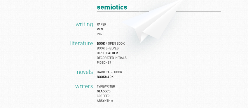
Even though the brief by itself is not necessary, it is really important to highlight the values that represent a new idea. Expressing concepts in words helps us get closer to express it visually as well. We asked the creators to write a list of keywords for us in different categories. We also explored the semiotics of the substance, like it’s shown in a fragment of our worksheet below:
I often like to work on creative visuals from a remote place, far from my usual routine but obviously, it’s not something I can always control. This time, however, I’ve been in the Danube Delta, keeping my endorphin level at the best possible balance, so I was sure that I could connect that two E letters in such class, that no other visual treatment would be required to deliver a sleek logo. But as I mentioned earlier, it often happens that this initial burst of ideas draws me too close to an idea that I should just let go, so I gave birth to quite a large selection of pointless double E letters.

Having pretty much no result here, I turned to the S with expectations that it would deliver better results than the E did.


I’m not saying that these were all failed attempts, they obviously proved to be more successful than my previous relationship with the two E’s, but we still didn’t quite grab the essence that we were aiming for.
At this point I realized that I would have to let go of the typo only solution and try to pay more attention to the keywordswe gathered, and approach the prey coming from a different path. The new proposals were less based on typographic solutions and more aiming towards a simple graphical representation of what Sweek would mean to the users.

The pen got ditched pretty quickly (since it was too closely associated with ‘traditional’ book writing, which is not the case with Sweek), but we liked the idea of a bookmark marking the E and we tried several variations of the approach.